


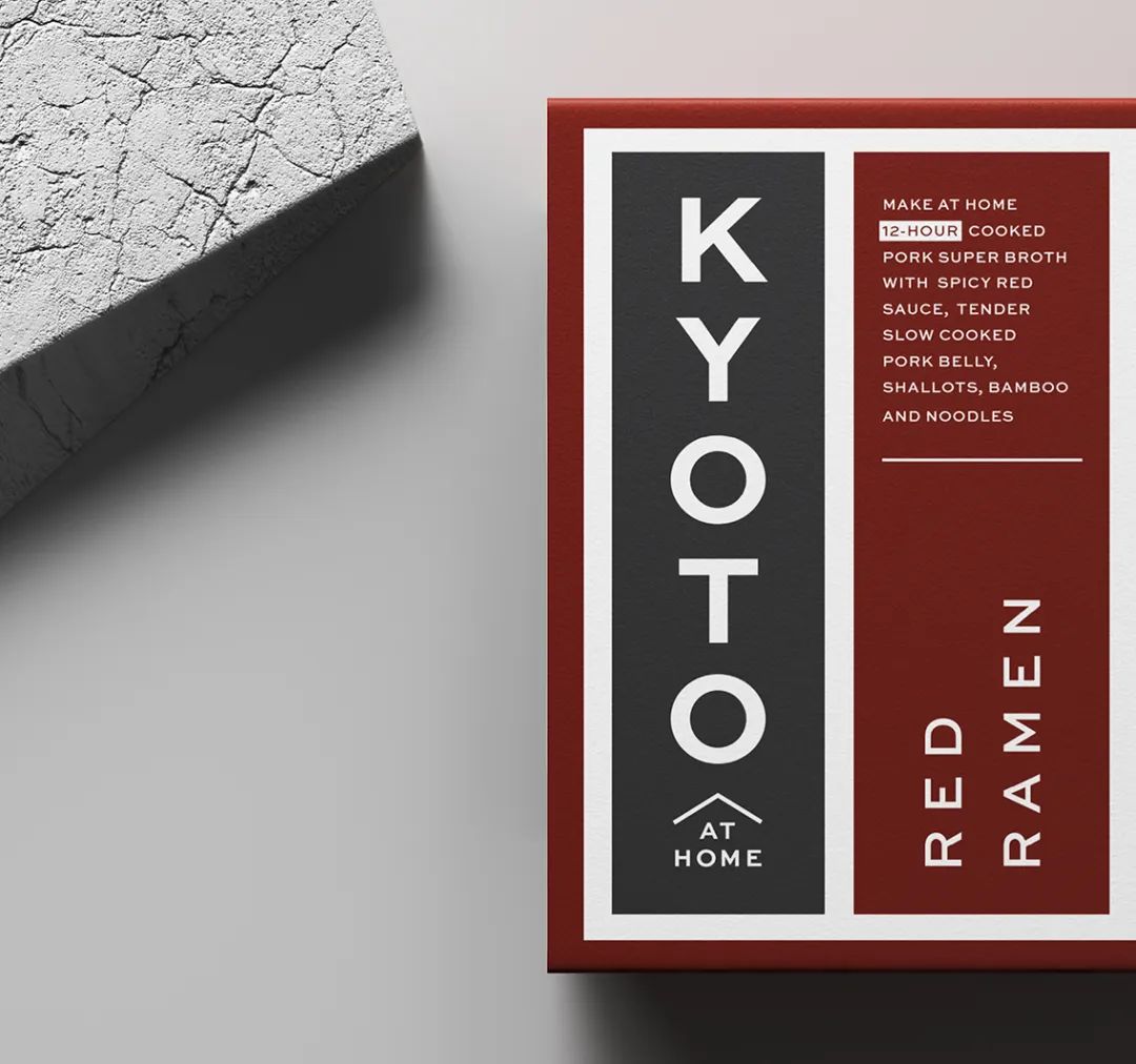
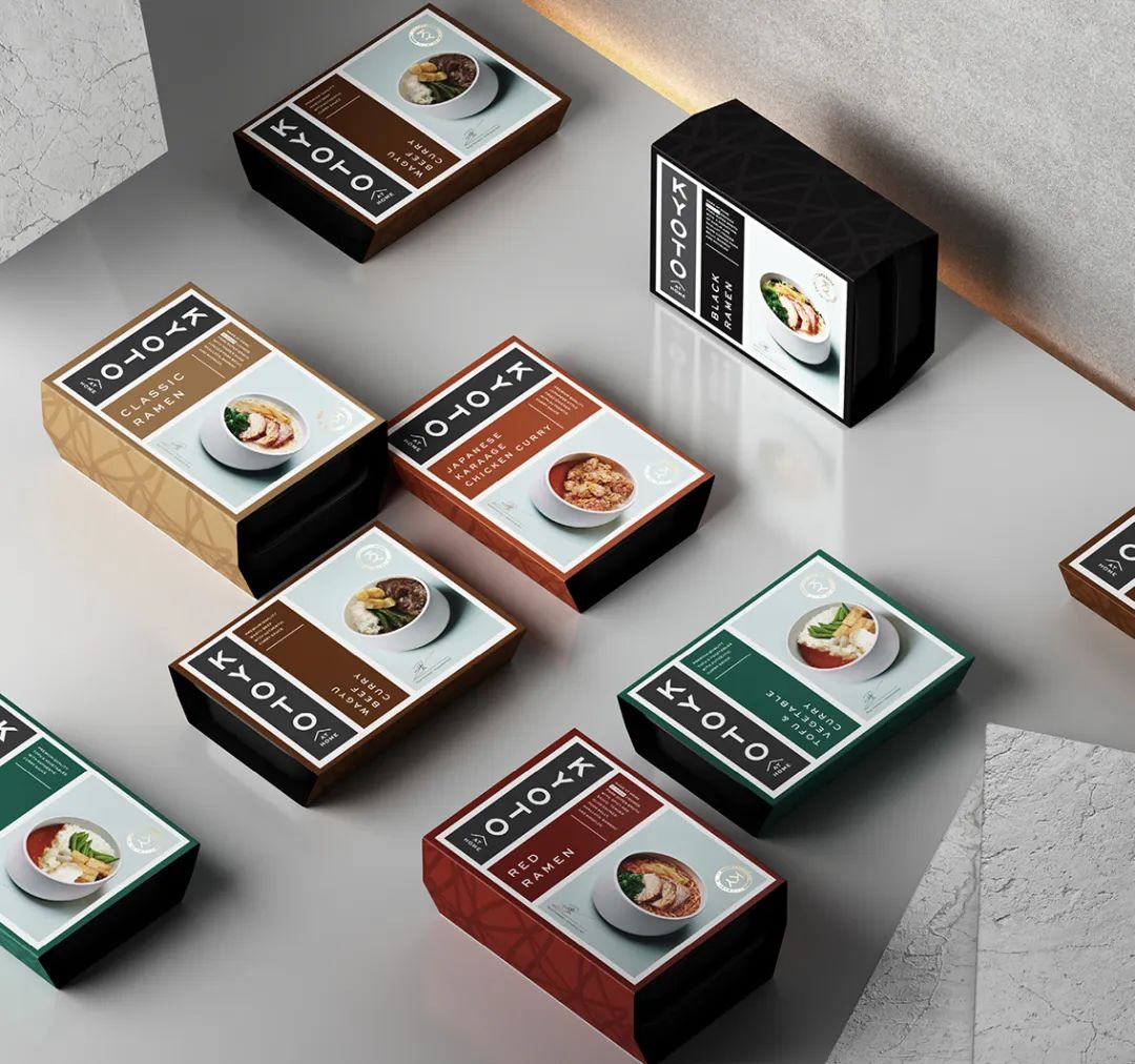
Kyoto At Home — The Stylish Dining In Option
/
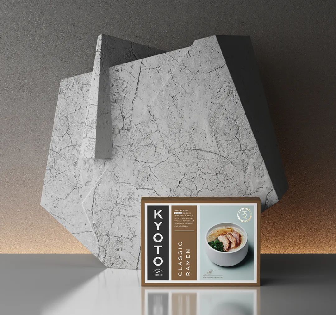
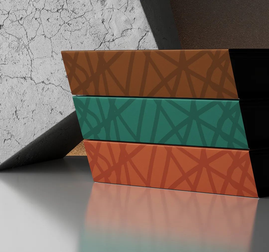
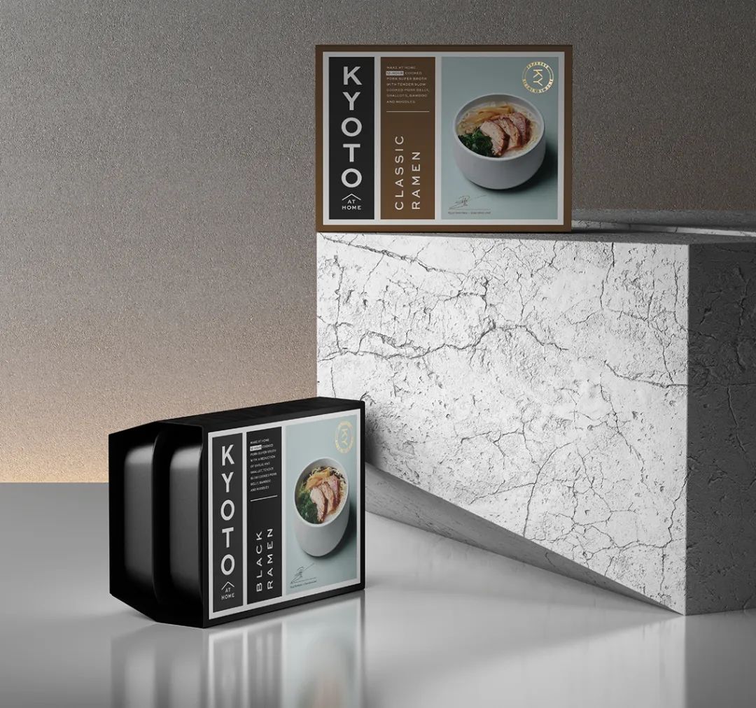
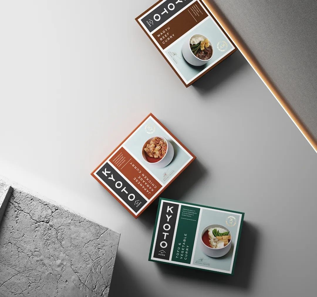
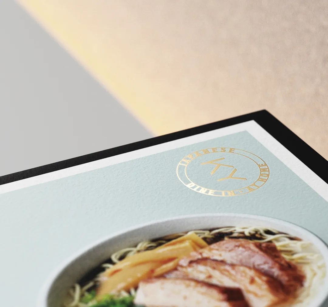
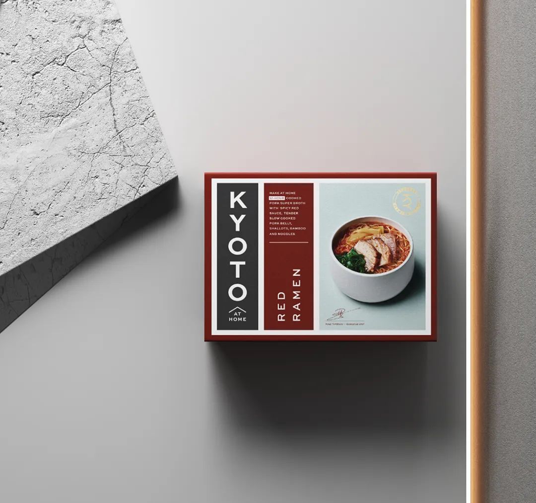
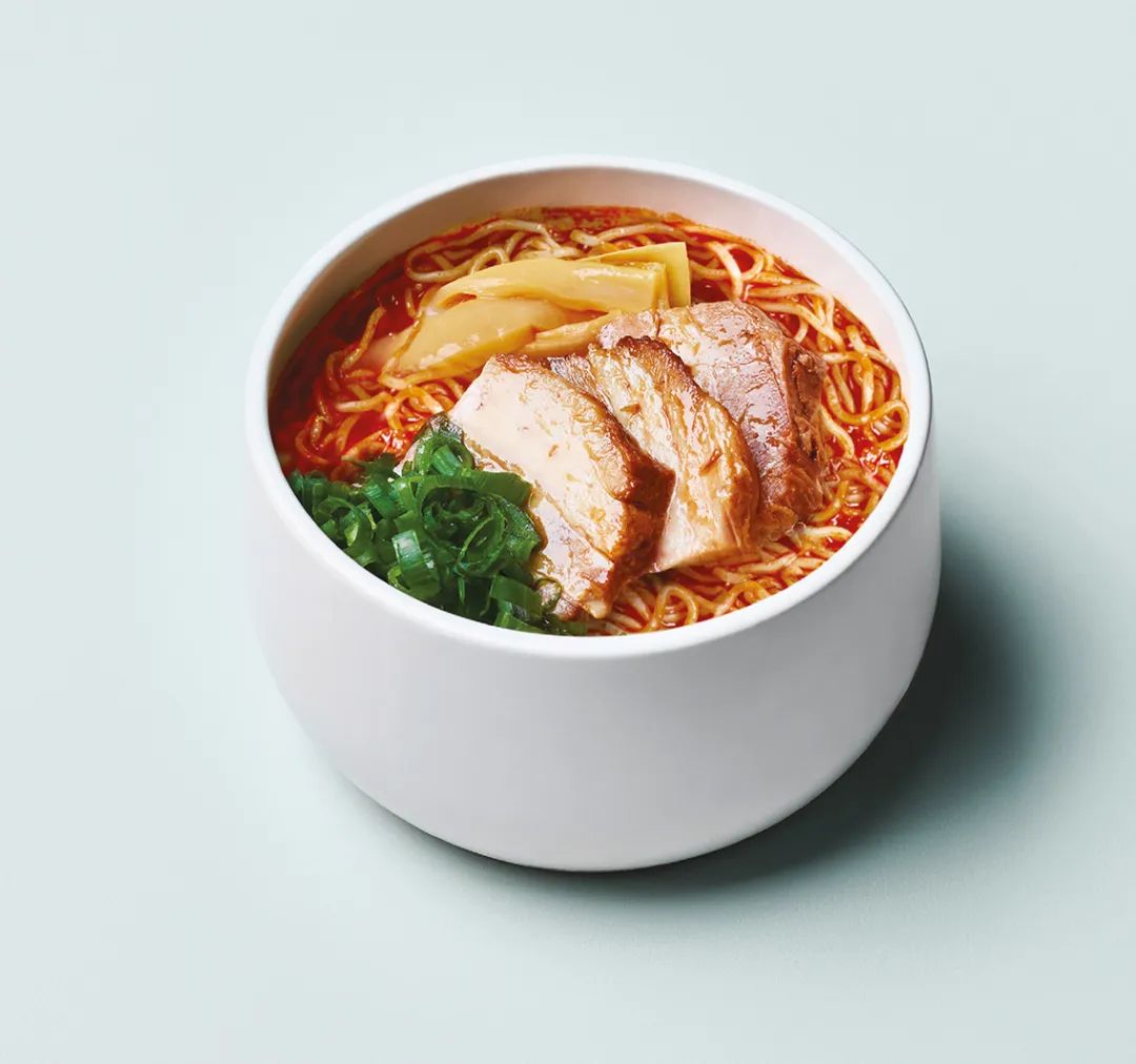
This ain't your normal take-out! Kyoto at home is sleek, stylish, and dare we say so beautifully designed we don't miss dining out because of it.This pre-made meal offering utilizes muted colors against a rich beige, as well as a simple sans-serif font with just the right amount of kerning. The meal looks luxurious enough to make the microwaveable food you're still considering look like a fool's errand.Sure, dining out can be fun, but Kyoto at home feels like a statement.
包装采用了富有层次的米色与柔和的色彩搭配,以及简单的无衬线字体,字距恰到好处。
-AND-
—— —— —— —— —— ——
往期导读:
简约可爱,食欲满满——日本カタシマ株式会社爆浆奶油巧克力及其他糕点包装设计欣赏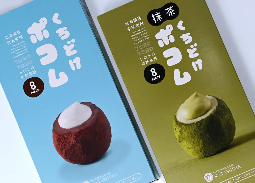
包豪斯现代装饰主义风格——The Cafe Deco包装设计欣赏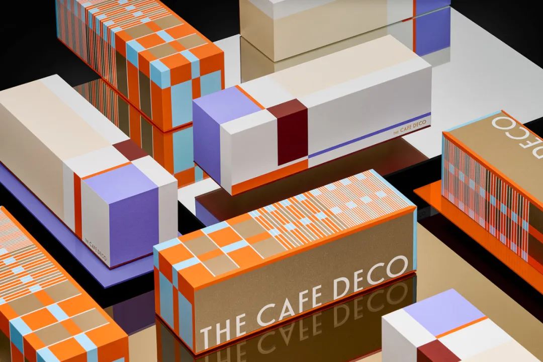
恬静淡雅的味道——日本お米屋さんのこめぬかべぃくど米糠蛋糕包装设计欣赏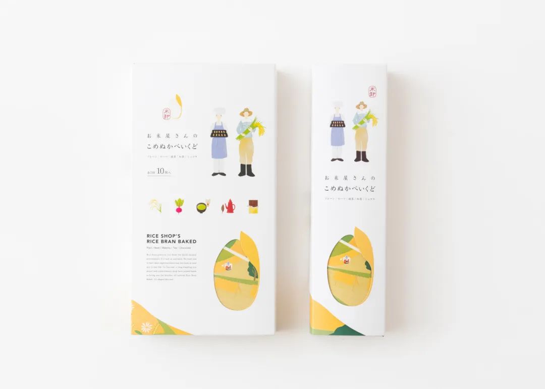
—— —— —— —— —— ——
创作交流wei xin:cylobo